A Practical Guide to K‑Means Clustering with Data Cleaning and Elbow Method
In the previous discussion we examined visual analytical methods for clustering, which helped us better understand relationships and structures within data. Now we turn to practical applicaiton, using the classic K‑means algorithm to train and evaluate a clustering model.
Building the Model
K‑means clustering aims to iteratively refine centroids so that samples within the same cluster become more similar, while differences between clusters increase. The algorithm is effective but has two notable drawbacks: sensitivity to outliers and the requirement to predefine K, the number of centroids. Fortunately, several techniques help us select a suitable K. We will start by cleaning the data to prepare it for clustering.
Data Preparation
We must remove unhelpful features and those that contain many outliers. Irrelevant fields and extreme values can harm the clustering result. Box plots provide an intuitive way to detect outliers.
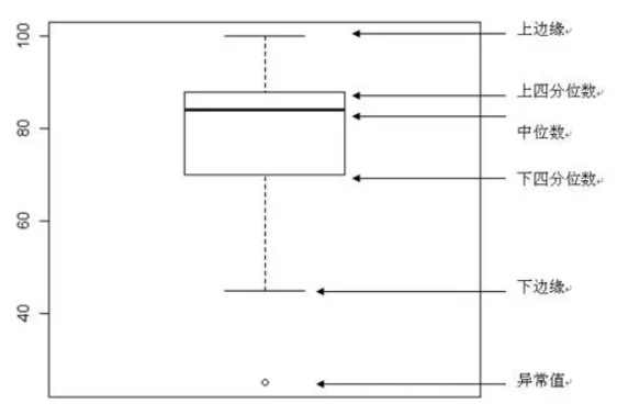
Understanding Box Plots
A box plot consists of five key statistics: minimum (lower fence), 25th percentile (Q1), median, 75th percentile (Q3), and maximum (upper fence). Outliers appear beyond the fences and are typically shown as individual dots. Identifying and handling these outliers before clustering is essential.
Data Cleaning
Ensure the required library are installed before proceeding.
pip install seaborn scikit-learn
Based on the previous analysis we keep the three most common genres only.
import matplotlib.pyplot as plt
import pandas as pd
import seaborn as sns
from sklearn.preprocessing import LabelEncoder

songs_df = pd.read_csv("../data/nigerian-songs.csv")
songs_df = songs_df[
    (songs_df['artist_top_genre'] == 'afro dancehall') |
    (songs_df['artist_top_genre'] == 'afropop') |
    (songs_df['artist_top_genre'] == 'nigerian pop')
]
songs_df = songs_df[songs_df['popularity'] > 0]
We then create box plots for each numeric column to inspect distributions and outliers.
plt.figure(figsize=(20, 20), dpi=200)

columns_to_plot = [
    'popularity', 'acousticness', 'energy', 'instrumentalness',
    'liveness', 'loudness', 'speechiness', 'tempo',
    'time_signature', 'danceability', 'length', 'release_date'
]

for idx, col in enumerate(columns_to_plot, start=1):
    plt.subplot(4, 3, idx)
    sns.boxplot(x=col, data=songs_df)
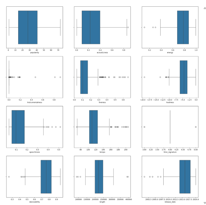
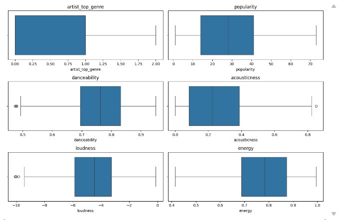
We then drop features whose box plots indicate many extreme anomalies, keeping only those shown below.
Next, numeric features need to be encoded appropriately for model training.
from sklearn.preprocessing import LabelEncoder

genre_encoder = LabelEncoder()
X = songs_df.loc[:, ['artist_top_genre', 'popularity', 'danceability',
                     'acousticness', 'loudness', 'energy']]
y = songs_df['artist_top_genre']

X['artist_top_genre'] = genre_encoder.fit_transform(X['artist_top_genre'])
y = genre_encoder.fit_transform(y)
K‑Means Clustering
Since the dataset does not inherently reveal how many genres exist, we use the elbow method to discover a suitable number of clusters.
Elbow Method
The elbow method tracks the within‑cluster sum of squares (WCSS) as K increases. The point where the reduction in WCSS levels off indicates the optimal K.
from sklearn.cluster import KMeans

inertia_values = []

for k in range(1, 11):
    kmeans_model = KMeans(n_clusters=k, init='k-means++', random_state=42)
    kmeans_model.fit(X)
    inertia_values.append(kmeans_model.inertia_)

plt.figure(figsize=(10, 5))
sns.lineplot(x=range(1, 11), y=inertia_values, marker='o', color='red')
plt.title('Elbow Method for Optimal K')
plt.xlabel('Number of clusters')
plt.ylabel('WCSS')
plt.show()
init='k-means++'improves centroid seeding.random_state=42ensures reproducibility.inertia_stores the sum of squared distances inside clusters.
The elbow is clearly visible at K = 3, after which additional clusters yield diminishing returns.
Training the Model
We first fit K‑Means with three clusters and evaluate performance.
kmeans_base = KMeans(n_clusters=3, init='k-means++', random_state=42)
kmeans_base.fit(X)
predicted_labels = kmeans_base.labels_

correct_predictions = sum(y == predicted_labels)
print(f"Result: {correct_predictions} out of {y.size} samples correctly labeled.")
print(f"Accuracy score: {correct_predictions / float(y.size):0.2f}")
Result: 105 out of 286 samples were correctly labeled.
Accuracy score: 0.37
The accuracy is worse than random guessing. Many retained features still contain outliers, which degrade K‑Means. We therefore scale the data.
from sklearn.preprocessing import StandardScaler

kmeans_scaled = KMeans(n_clusters=3, init='k-means++', random_state=42)
feature_scaler = StandardScaler()
X_transformed = feature_scaler.fit_transform(X)

kmeans_scaled.fit(X_transformed)
scaled_labels = kmeans_scaled.labels_

correct_predictions_scaled = sum(y == scaled_labels)
print(f"Result: {correct_predictions_scaled} out of {y.size} samples correctly labeled.")
print(f"Accuracy score: {correct_predictions_scaled / float(y.size):0.2f}")
Result: 163 out of 286 samples were correctly labeled.
Accuracy score: 0.57
StandardScaler centers each feature to mean 0 and variance 1, equalising their influence on distance calculations. This prevents features with larger ranges from dominating the clustering, leading to a notable accuracy improvement.
Summary
This article walked through applying K‑Means clustering to real‑world data. We cleaned the dataset using box plots, selected the optimal K with the elbow method, and demonstrated how standardisation can dramatically improve cluster quality. The model’s accuracy rose from 37% to 57%, highlighting the critical role of data preprocessing. Clean, well‑scaled data not only enhances model reliability but also yields more meaningful analytical insights.
