Implementing Light and Dark Theme Switching with CSS Variables and JavaScript
Many project require support for multiple color schemes, such as light and dark themes, as shown below:
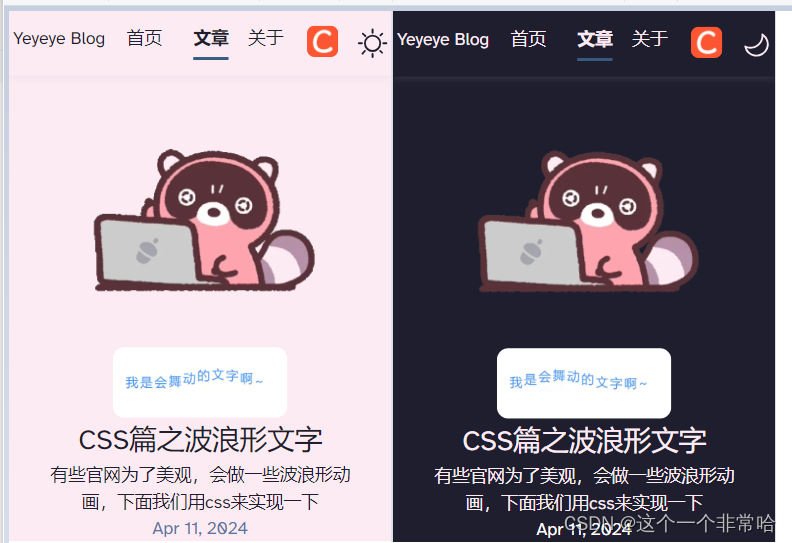
How is this implemented?
Method 1: Using CSS Variables
CSS variables can be defined to manage theme colors. For example, a default light theme and a dark theme can be set up as follows:
/* Default light theme */
:root {
    --underline-dark: #000d8a;
    --gray-light: 229, 233, 240;
    --gray-dark: 34, 41, 57;
    --black: 15, 18, 25;
    --underline: #375a7f;
    --gray: 96, 115, 159;
    --box-shadow: 0 2px 6px rgba(var(--gray), 25%), 0 8px 24px rgba(var(--gray), 33%),
        0 16px 32px rgba(var(--gray), 33%);
    --background: #fdebf3;
    --text: #1e1e2e;
    --border-top-color: rgba(var(--gray), 25%);
}

/* Dark theme */
:root.dark {
    --text: #fdebf3;
    --background: #1e1e2e;
    --underline: #375a7f;
    --black: 0, 0, 0;
    --gray: 255, 255, 255;
    --box-shadow: 0 2px 6px rgba(var(--gray), 25%), 0 8px 24px rgba(var(--gray), 33%),
        0 16px 32px rgba(var(--gray), 33%);
    --border-top-color: rgba(var(--gray), 25%);
    --button: #78c2ad;
    --text-light: #1e1e2e;
    --text-link: #78c2ad;
    --header: "Pacifico", cursive;
    --body: "Josefin Sans", sans-serif;
}
When switching to the dark theme, the variables under .dark are applied to change colors.
Notte: All global colors, including background-color, should use variables for configuration, e.g., background: var(--background);.
It is recommended to use RGB values in CSS variables for easier handling of opacity. For example, define --black and use it like box-shadow: 0 2px 8px rgba(var(--black), 10%); without needing additional variables.
A toggle button can be implemented with the following HTML:
<button id="themeToggle" title="Theme Toggle">
    <svg width="30px" xmlns="http://www.w3.org/2000/svg" viewBox="0 0 24 24">
        <path class="sun" fill-rule="evenodd" d="M12 17.5a5.5 5.5 0 1 0 0-11 5.5 5.5 0 0 0 0 11zm0 1.5a7 7 0 1 0 0-14 7 7 0 0 0 0 14zm12-7a.8.8 0 0 1-.8.8h-2.4a.8.8 0 0 1 0-1.6h2.4a.8.8 0 0 1 .8.8zM4 12a.8.8 0 0 1-.8.8H.8a.8.8 0 0 1 0-1.6h2.5a.8.8 0 0 1 .8.8zm16.5-8.5a.8.8 0 0 1 0 1l-1.8 1.8a.8.8 0 0 1-1-1l1.7-1.8a.8.8 0 0 1 1 0zM6.3 17.7a.8.8 0 0 1 0 1l-1.7 1.8a.8.8 0 1 1-1-1l1.7-1.8a.8.8 0 0 1 1 0zM12 0a.8.8 0 0 1 .8.8v2.5a.8.8 0 0 1-1.6 0V.8A.8.8 0 0 1 12 0zm0 20a.8.8 0 0 1 .8.8v2.4a.8.8 0 0 1-1.6 0v-2.4a.8.8 0 0 1 .8-.8zM3.5 3.5a.8.8 0 0 1 1 0l1.8 1.8a.8.8 0 1 1-1 1L3.5 4.6a.8.8 0 0 1 0-1zm14.2 14.2a.8.8 0 0 1 1 0l1.8 1.7a.8.8 0 0 1-1 1l-1.8-1.7a.8.8 0 0 1 0-1z" />
        <path class="moon" fill-rule="evenodd" d="M16.5 6A10.5 10.5 0 0 1 4.7 16.4 8.5 8.5 0 1 0 16.4 4.7l.1 1.3zm-1.7-2a9 9 0 0 1 .2 2 9 9 0 0 1-11 8.8 9.4 9.4 0 0 1-.8-.3c-.4 0-.8.3-.7.7a10 10 0 0 0 .3.8 10 10 0 0 0 9.2 6 10 10 0 0 0 4-19.2 9.7 9.7 0 0 0-.9-.3c-.3-.1-.7.3-.6.7a9 9 0 0 1 .3.8z" />
    </svg>
</button>
JavaScript Implementation for Theme Toggle
JavaScript can be used to control the theme switching, with support for user preferences and local storage:
<script is:inline>
    // Determine the initial theme
    const currentTheme = (() => {
        if (localStorage.getItem('theme')) return localStorage.getItem('theme');
        if (window.matchMedia('(prefers-color-scheme: dark)').matches) return 'dark';
        return 'light';
    })();
    localStorage.setItem('theme', currentTheme);

    // Initialize the theme
    const initializeTheme = () => {
        const rootElement = document.documentElement;
        rootElement.classList.add(currentTheme);
    };
    initializeTheme();

    // Handle theme toggle
    const toggleTheme = () => {
        const rootElement = document.documentElement;
        rootElement.classList.toggle('dark');
        const isDarkMode = rootElement.classList.contains("dark");
        localStorage.setItem("theme", isDarkMode ? "dark" : "light");
    };
    document.getElementById("themeToggle").addEventListener("click", toggleTheme);
</script>
CSS for the toggle button icons can be styled as follows:
.moon {
    fill: transparent;
}

.sun {
    fill: var(--text);
}

:global(.dark) .moon {
    fill: var(--text);
}

:global(.dark) .sun {
    fill: transparent;
}
Method 2: Using Atomic CSS
For an alternative apprroach, consider using atomic CSS frameworks like Tailwind CSS, which provides built-in support for dark mode. Refer to the Dark Mode - Tailwind CSS Documentation for more details.
