Python Advanced Plotting
Line Plot
import matplotlib.pyplot as plt
import numpy as np
import pandas as pd
import seaborn as sns
import warnings
warnings.filterwarnings("ignore")
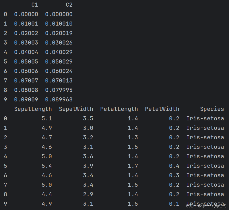
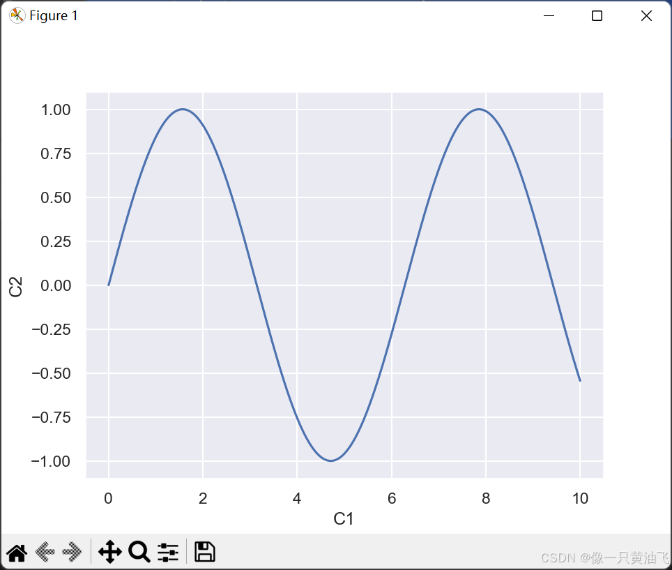
col1 = np.linspace(0, 10, 1000)
col2 = np.sin(col1)
df = pd.DataFrame({"C1": col1, "C2": col2})
print(df.head(10))
sns.set_theme(style="darkgrid")
sns.lineplot(x=df.C1, y=df.C2, data=df)
plt.show()
############################################################################
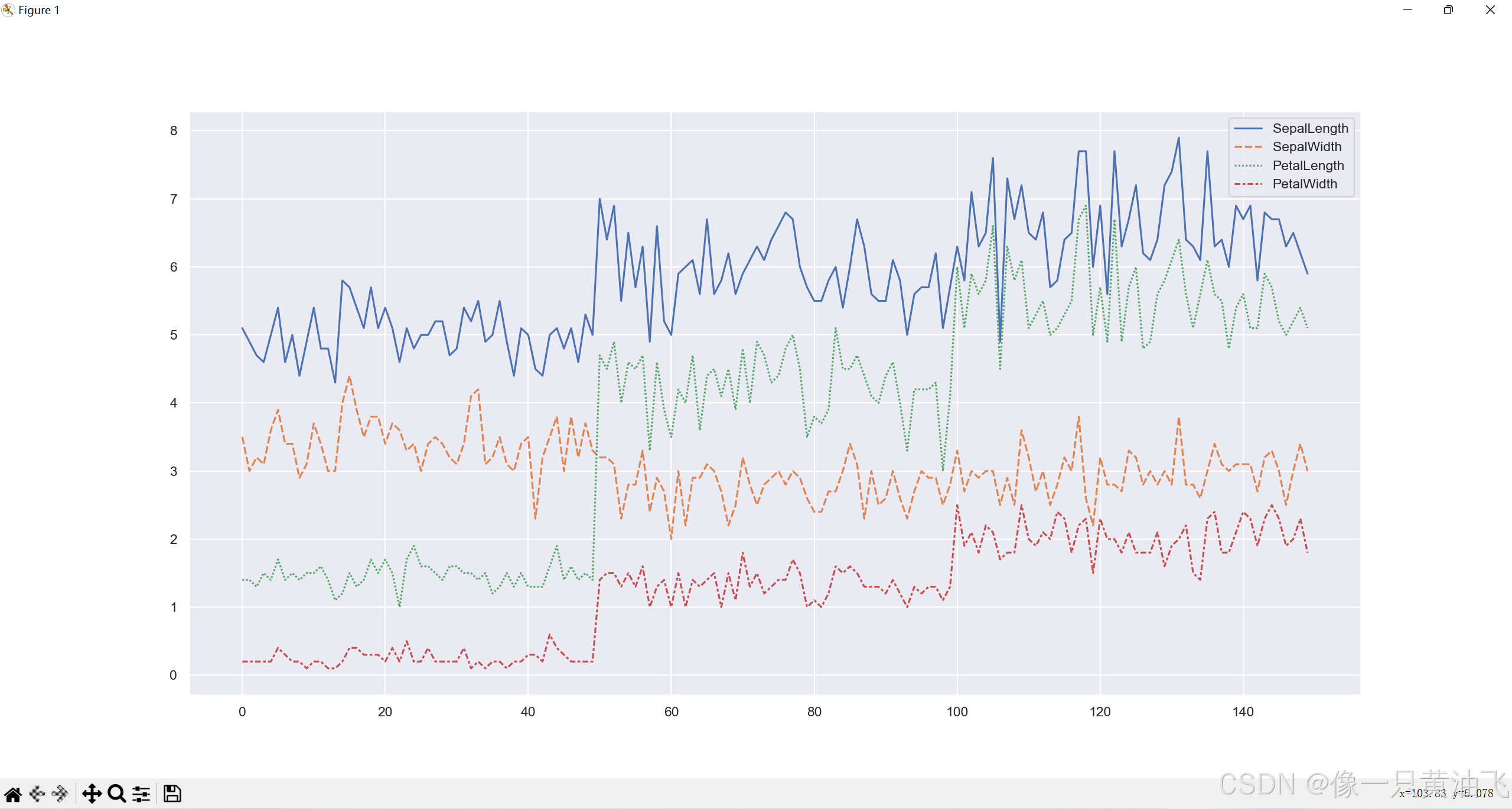
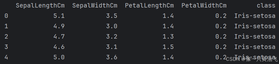
iris = pd.read_csv('iris.data', header=None)
iris.columns = ['SepalLength', 'SepalWidth', 'PetalLength', 'PetalWidth', 'Species']
print(iris.head(10))
plt.figure(figsize=(20, 8))
sns.lineplot(data=iris)
plt.show()
############################################################################
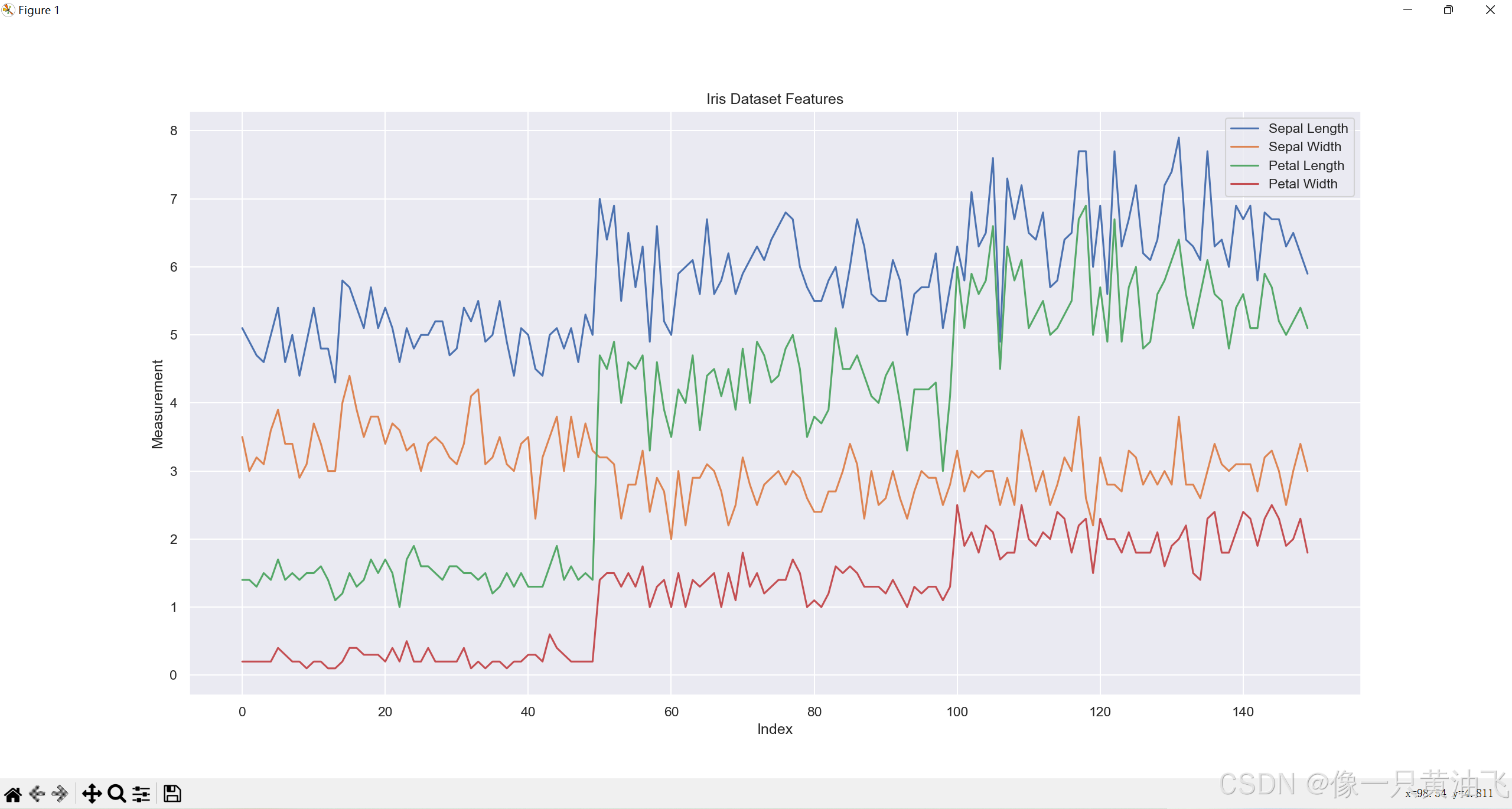
plt.figure(figsize=(20,8))
plt.plot(iris['SepalLength'], label='Sepal Length')
plt.plot(iris['SepalWidth'], label='Sepal Width')
plt.plot(iris['PetalLength'], label='Petal Length')
plt.plot(iris['PetalWidth'], label='Petal Width')
plt.legend()
plt.xlabel('Index')
plt.ylabel('Measurement')
plt.title('Iris Dataset Features')
plt.show()
############################################################################
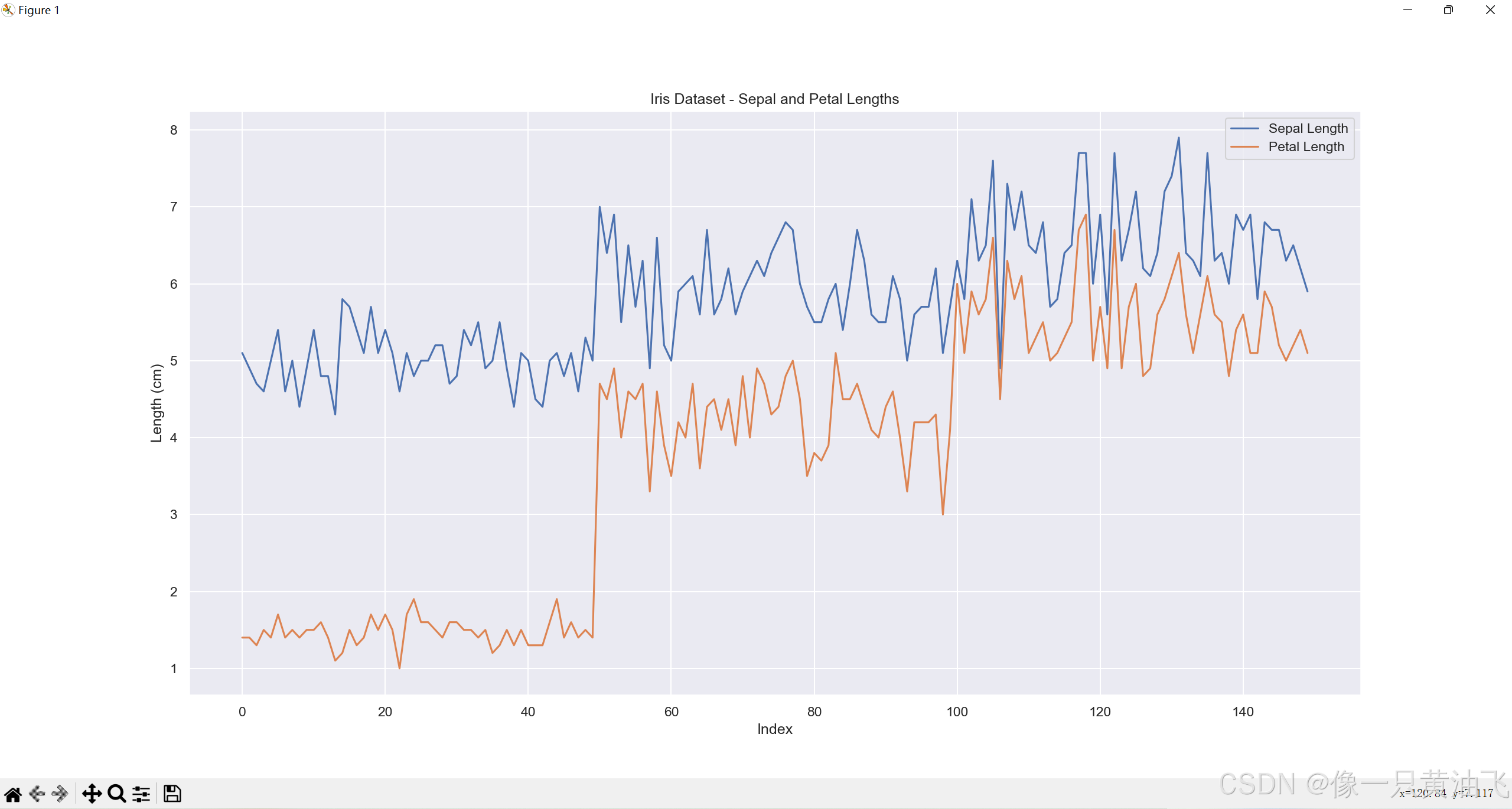
plt.figure(figsize=(20, 8))
plt.plot(iris['SepalLength'], label='Sepal Length')
plt.plot(iris['PetalLength'], label='Petal Length')
plt.legend()
plt.xlabel('Index')
plt.ylabel('Length (cm)')
plt.title('Iris Dataset - Sepal and Petal Lengths')
plt.show()
Dansity Plot
import numpy as np
import pandas as pd
import seaborn as sns
import matplotlib as mpl
import warnings
from matplotlib import pyplot as plt
warnings.filterwarnings("ignore")
sns.set_style("white")
names = ['SepalLengthCm', 'SepalWidthCm', 'PetalLengthCm', 'PetalWidthCm', 'class']
iris = pd.read_csv('iris.data', names=names)
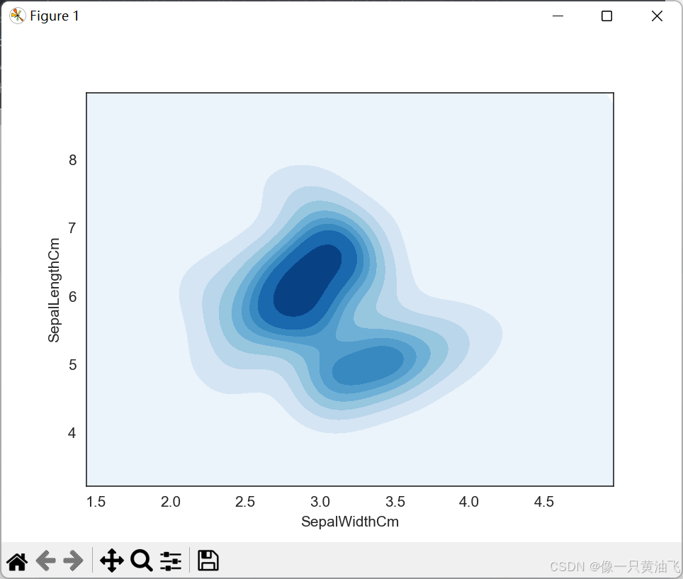
sns.kdeplot(data=iris, x='SepalWidthCm', y='SepalLengthCm', shade=True, cmap='Blues', shade_lowest=True)
plt.show()
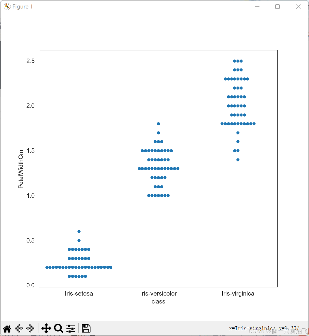
plt.figure(figsize=(7, 7))
sns.swarmplot(x='class', y='PetalWidthCm', data=iris)
plt.show()
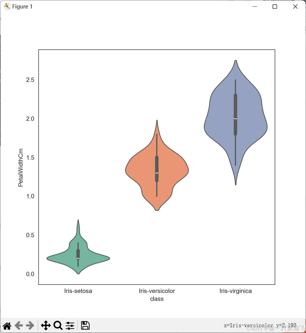
Violin Plot
import numpy as np
import pandas as pd
import seaborn as sns
import matplotlib as mpl
import warnings
from matplotlib import pyplot as plt

warnings.filterwarnings("ignore")
sns.set_style("white")

names = ['SepalLengthCm', 'SepalWidthCm', 'PetalLengthCm', 'PetalWidthCm', 'class']
iris = pd.read_csv('iris.data', names=names)

plt.figure(figsize=(7, 7))
sns.violinplot(x="class", y="PetalWidthCm", data=iris, palette='Set2', dodge=False)
plt.show()
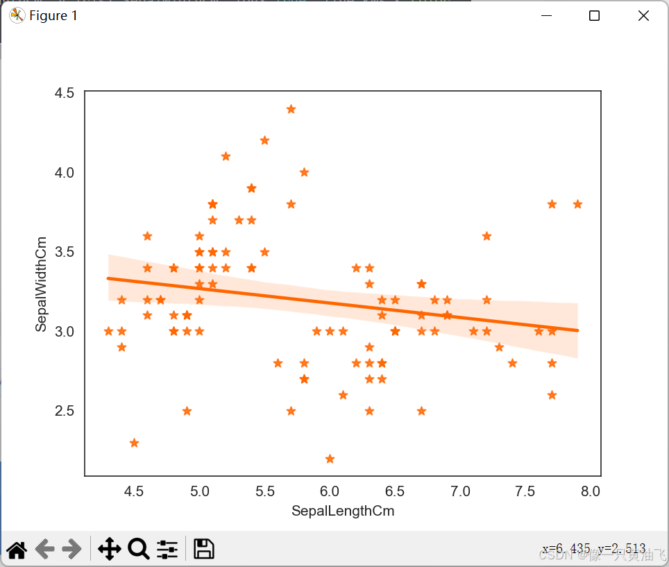
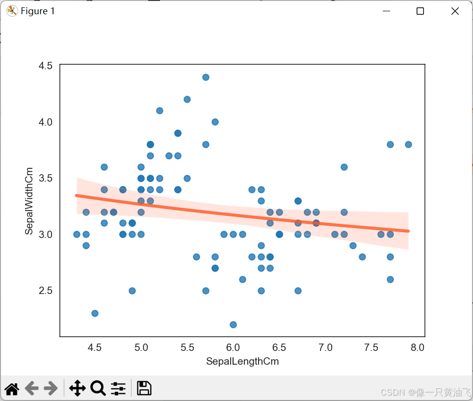
Regresssion Plot
import pandas as pd
import seaborn as sns
import matplotlib as mpl
import warnings
from matplotlib import pyplot as plt

warnings.filterwarnings("ignore")
sns.set_style("white")

names = ['SepalLengthCm', 'SepalWidthCm', 'PetalLengthCm', 'PetalWidthCm', 'class']
iris = pd.read_csv('iris.data', names=names)
iris1 = iris[iris['class'].isin(['Iris-setosa', 'Iris-versicolour', 'Iris-virginica'])]

sns.regplot(x=iris1.SepalLengthCm, y=iris1.SepalWidthCm, color='#FF6600', marker='*')
plt.show()

sns.regplot(x=iris1.SepalLengthCm, y=iris1.SepalWidthCm, logx=True, line_kws={'color':'#FF5722', 'alpha':0.8, 'lw':3})
plt.show()
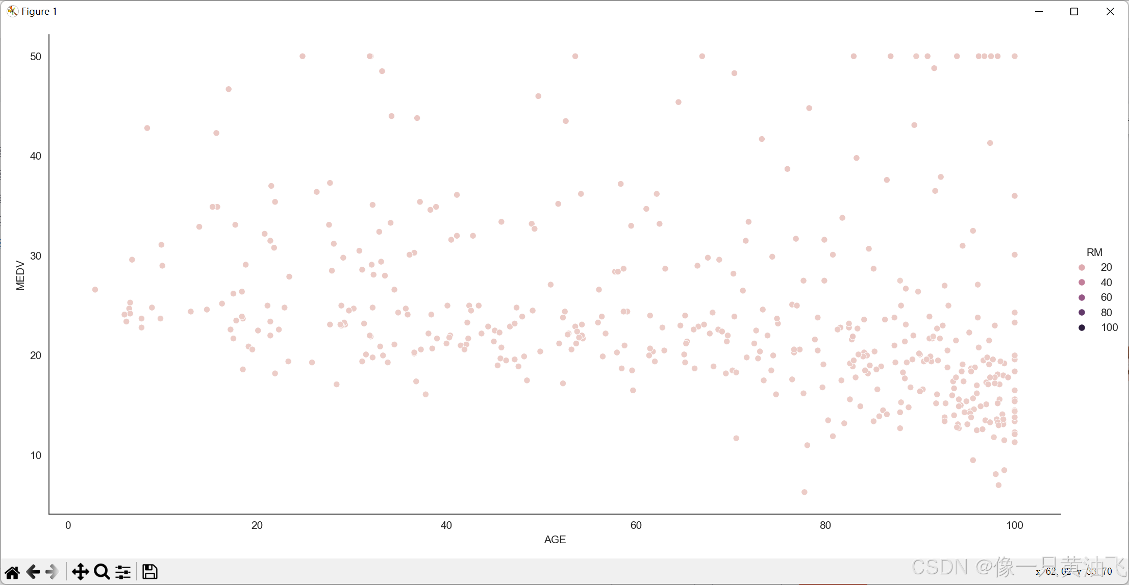
Scatter Plot
import numpy as np
import pandas as pd
import seaborn as sns
import warnings
import matplotlib.pyplot as plt

warnings.filterwarnings("ignore")
sns.set_style("white")

housing = pd.read_csv('housing.csv')

sns.relplot(x='AGE', y='MEDV', hue='RM', data=housing, height=7, aspect=2)
plt.show()
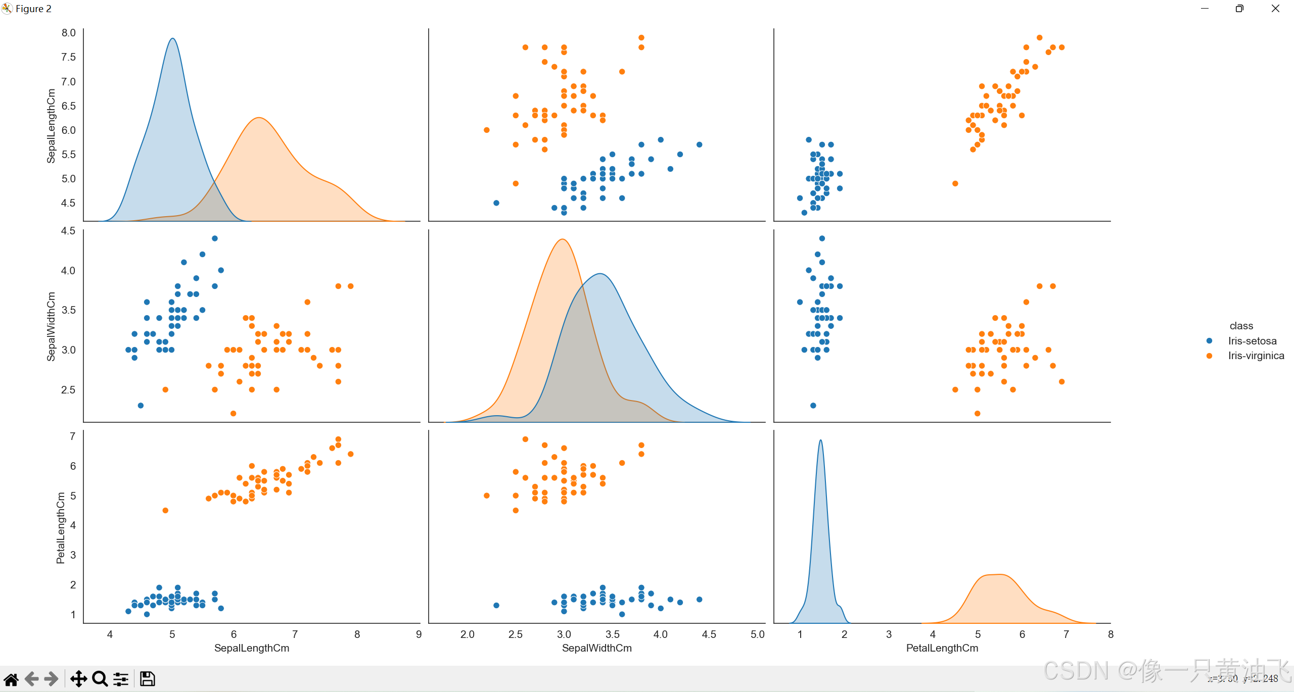
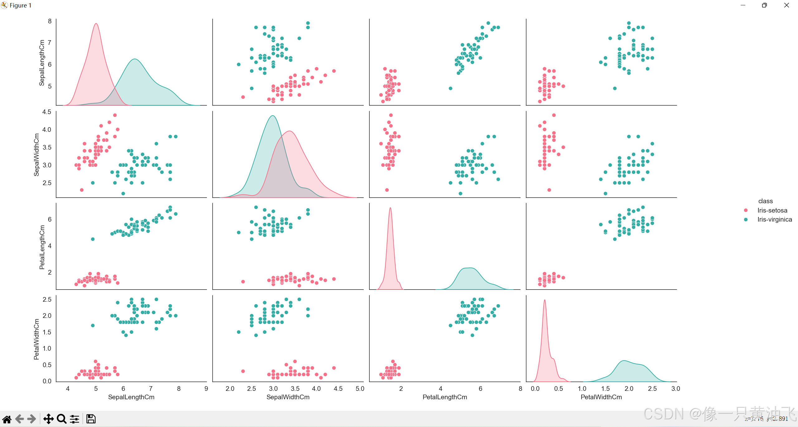
Scatterplot Matrix
import pandas as pd
import seaborn as sns
import warnings
from matplotlib import pyplot as plt

warnings.filterwarnings("ignore")
sns.set_style("white")

names = ['SepalLengthCm', 'SepalWidthCm', 'PetalLengthCm', 'PetalWidthCm', 'class']
iris = pd.read_csv('iris.data', names=names)
print(iris.head())
iris1 = iris[iris['class'].isin(['Iris-setosa', 'Iris-versicolour', 'Iris-virginica'])]

sns.pairplot(iris1, hue='class', palette='husl', size=2)
sns.pairplot(iris1, hue='class', vars=['SepalLengthCm','SepalWidthCm','PetalLengthCm'], height=3, aspect=1)
plt.show()
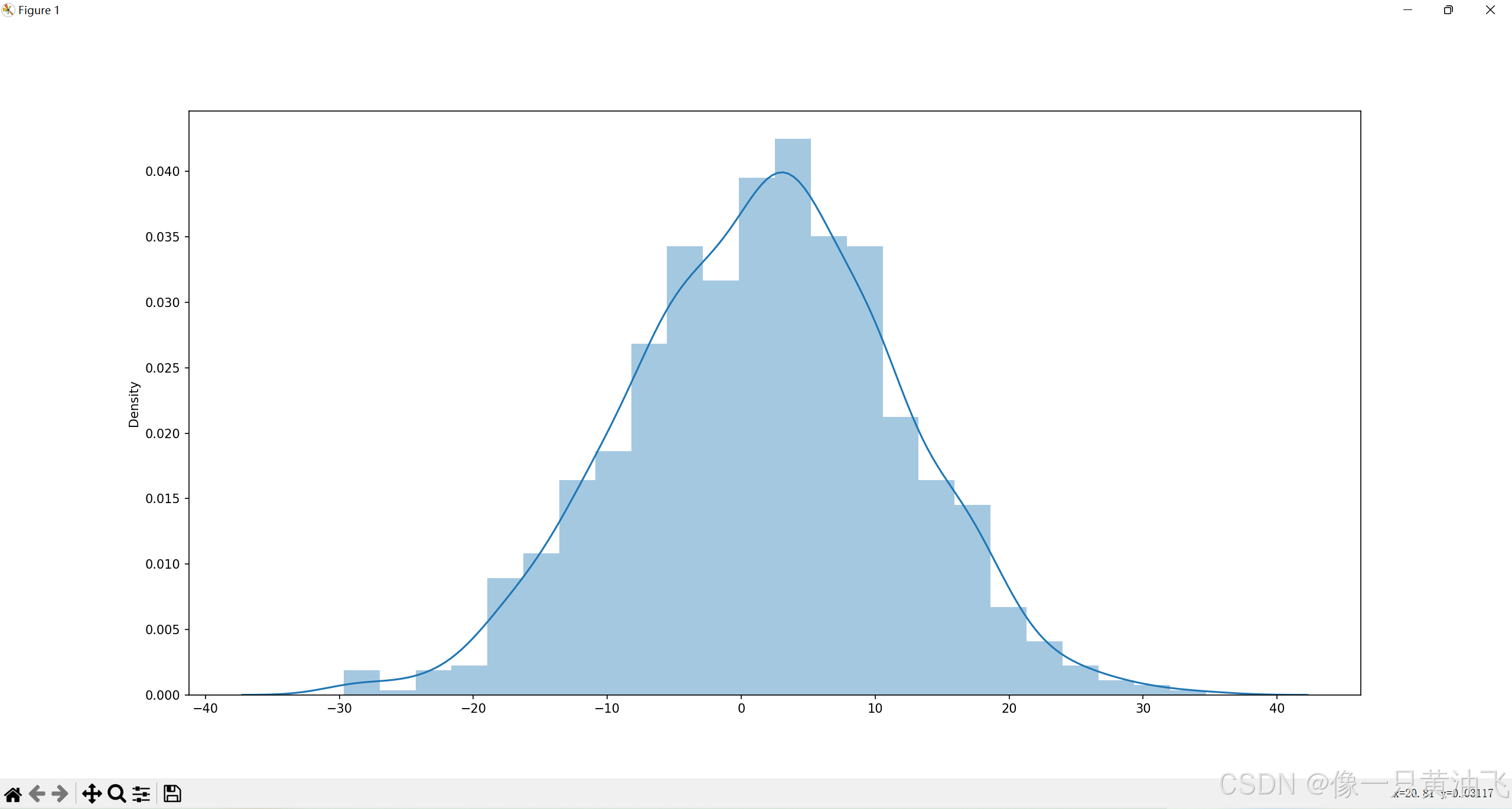
Histogram
import matplotlib.pyplot as plt
import numpy as np
import pandas as pd
import seaborn as sns
import warnings
warnings.filterwarnings("ignore")
mpl.rcParams.update(mpl.rcParamsDefault)
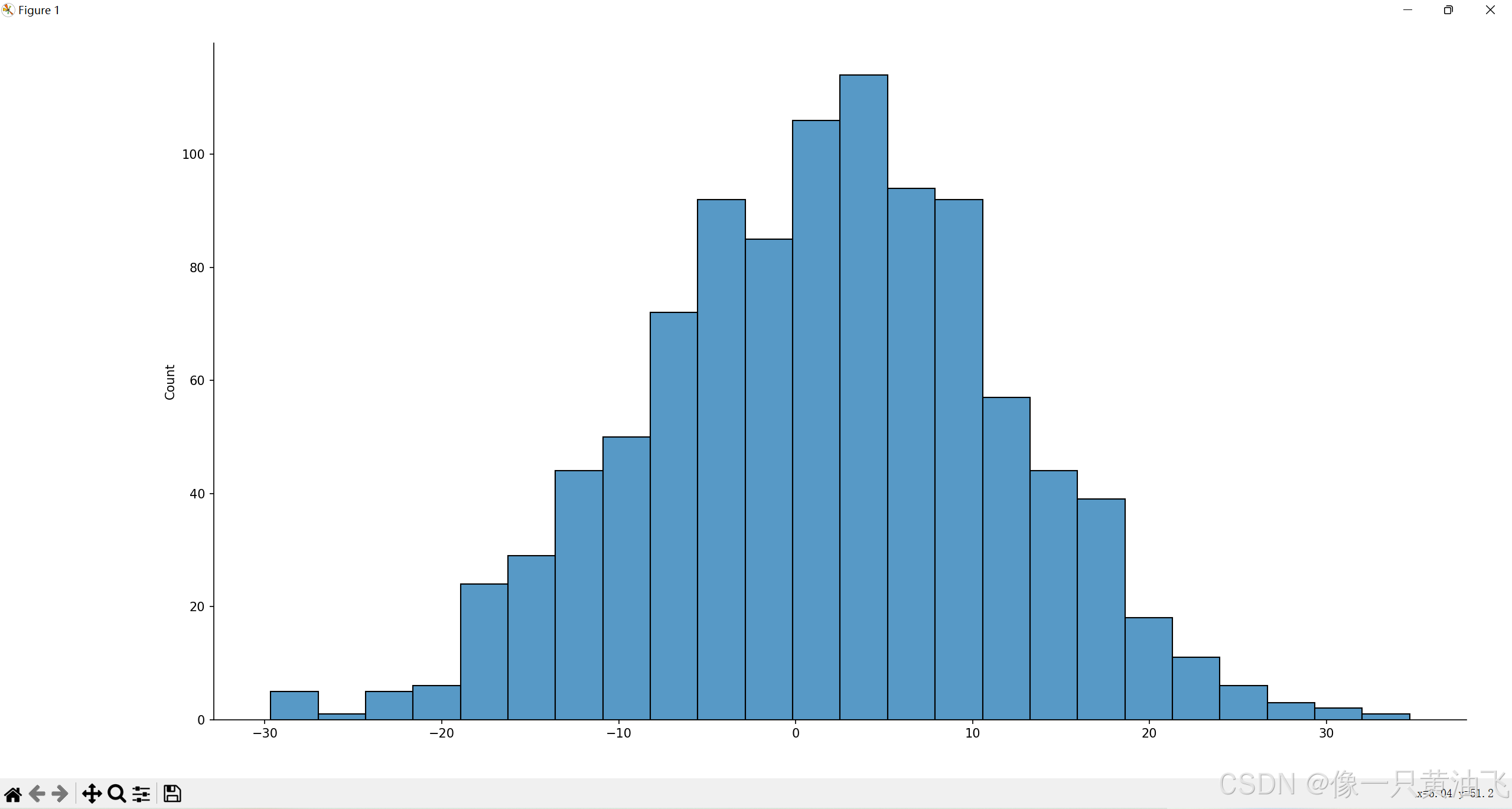
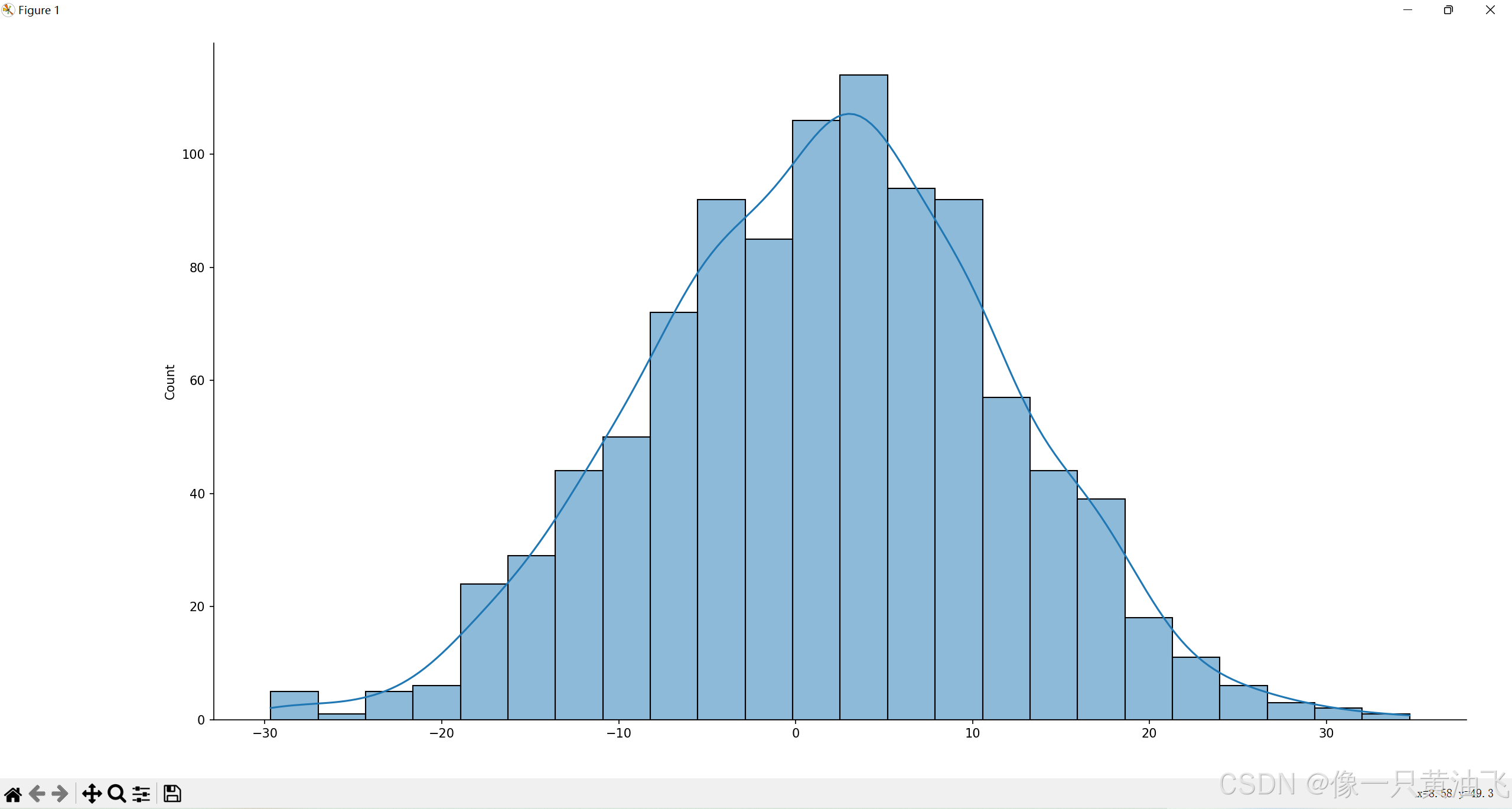
num = np.random.normal(1,10,1000)
sns.distplot(num)
plt.show()
sns.displot(num, kde=False)
plt.show()
sns.displot(num, kde=True)
plt.show()
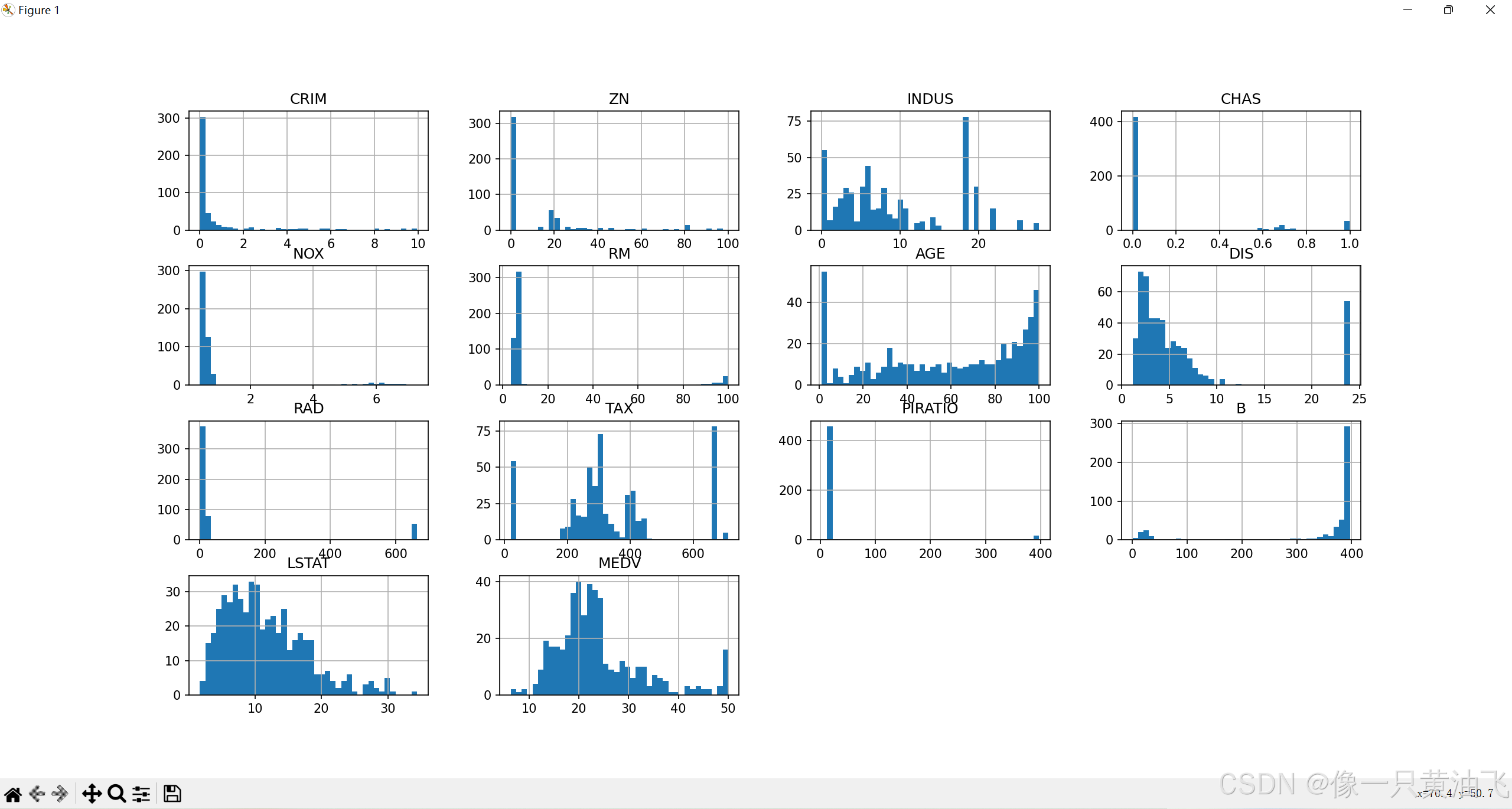
housing = pd.read_csv('housing.csv')
print(housing.head())
housing.hist(bins=40, figsize=(20, 20))
plt.show()
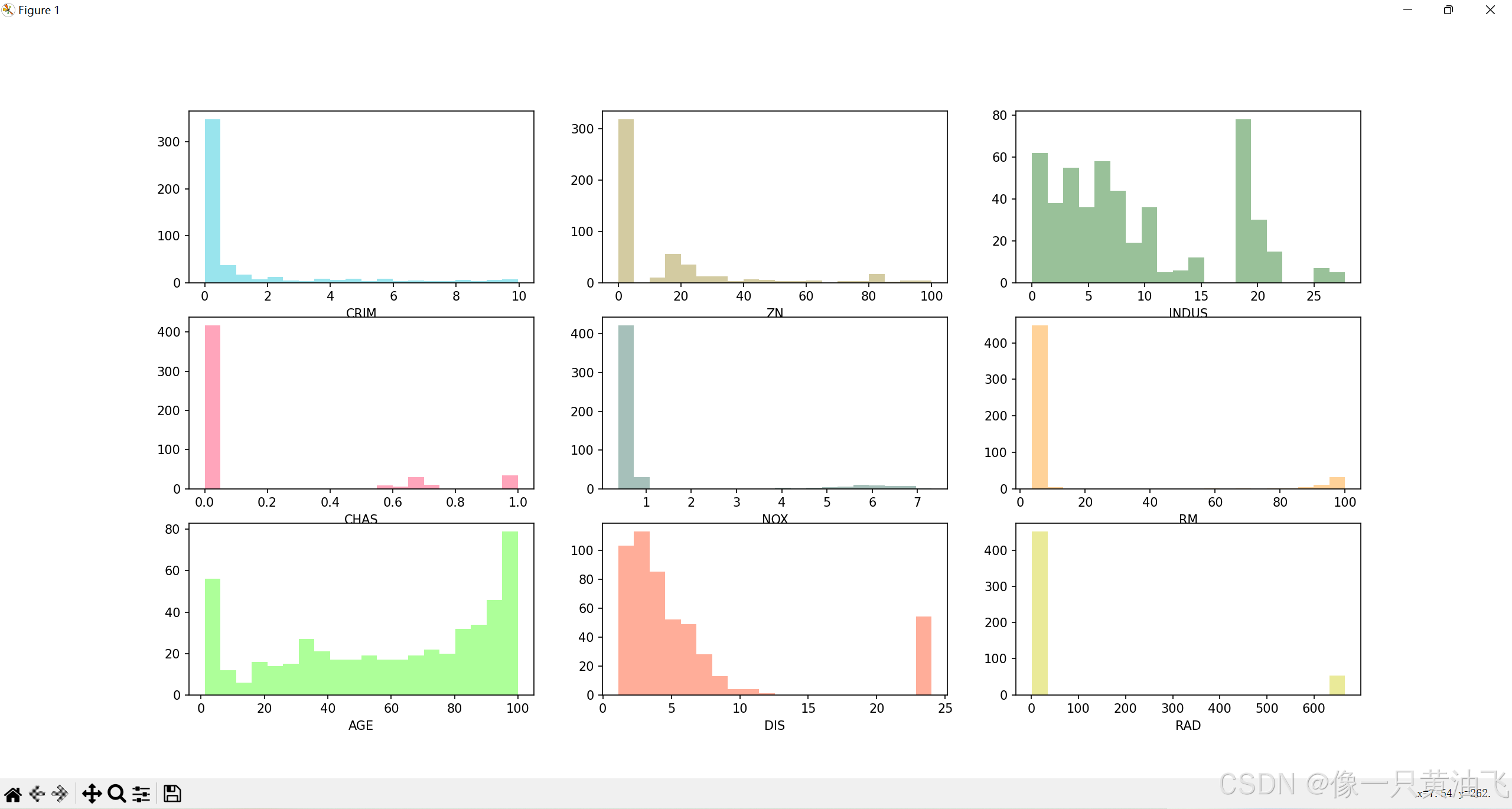
fig1, axes = plt.subplots(nrows=3,ncols=3, figsize=(20,20))
sns.distplot(housing["CRIM"], color="#00bcd4",ax=axes[0, 0], kde=False, bins=20)
sns.distplot(housing["ZN"], color="#937d14",ax=axes[0, 1], kde=False, bins=20)
sns.distplot(housing["INDUS"], color="#006600", ax=axes[0, 2], kde=False, bins=20)
sns.distplot(housing["CHAS"], color="#ff1e56", ax=axes[1,0], kde=False, bins=20)
sns.distplot(housing["NOX"], color="#216353", ax=axes[1, 1], kde=False, bins=20)
sns.distplot(housing["RM"], color="#FF8F00", ax=axes[1,2], kde=False, bins=20)
sns.distplot(housing["AGE"], color="#33FF00", ax=axes[2, 0], kde=False, bins=20)
sns.distplot(housing["DIS"], color="#FF3300", ax=axes[2, 1], kde=False, bins=20)
sns.distplot(housing["RAD"], color="#cccc00", ax=axes[2, 2], kde=False, bins=20)
plt.show()
Box Plot
import numpy as np
import pandas as pd
import seaborn as sns
import warnings
from matplotlib import pyplot as plt
warnings.filterwarnings("ignore")
sns.set_style("white")
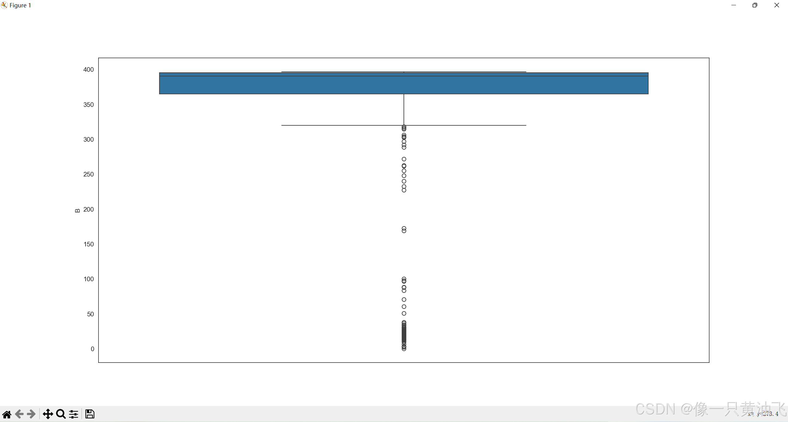
housing = pd.read_csv('housing.csv')
sns.boxplot(housing.B)
plt.show()
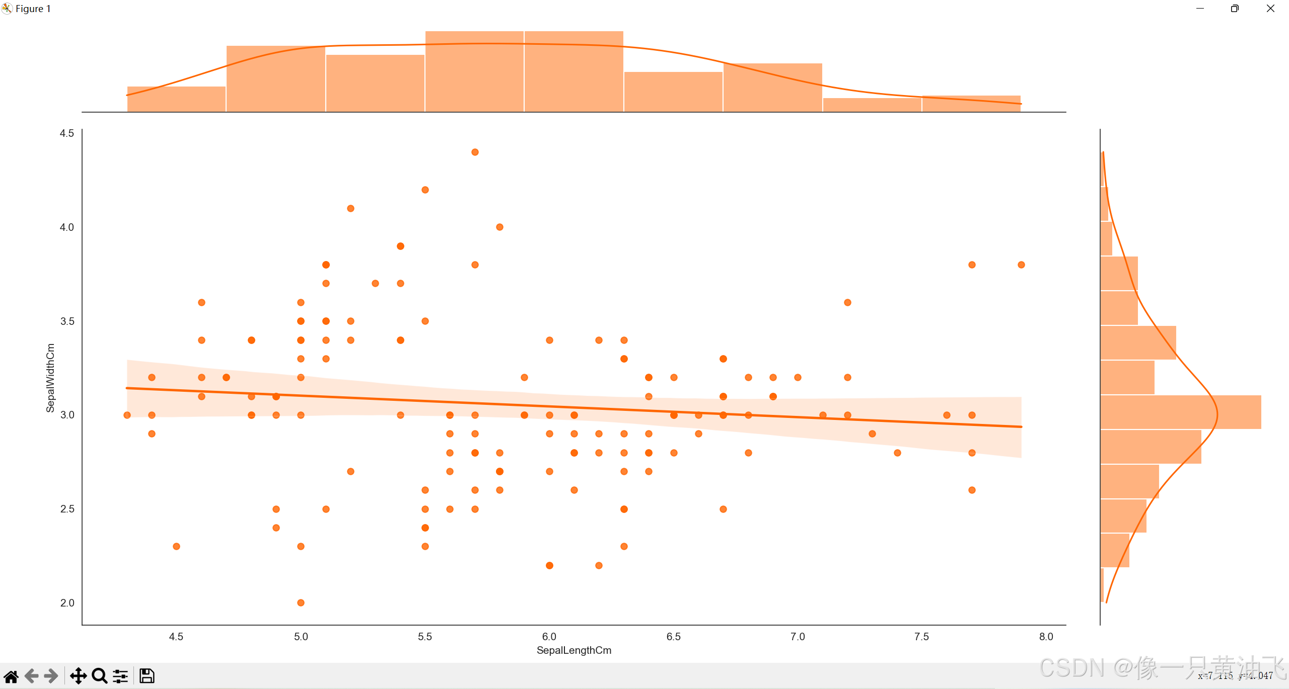
Joint Plot
import pandas as pd
import seaborn as sns
import warnings
from matplotlib import pyplot as plt

warnings.filterwarnings("ignore")
sns.set_style("white")

names = ['SepalLengthCm', 'SepalWidthCm', 'PetalLengthCm', 'PetalWidthCm', 'class']
iris = pd.read_csv('iris.data', names=names)
sns.jointplot(x='SepalLengthCm', y='SepalWidthCm', data=iris, height=10, kind='reg', color='#FF6600')
plt.show()